The Slideshow appears as a large banner under the Main Menu, and is best viewed using a large screen. You can save several slideshows at a time in the Slideshow Manager. Each slideshow can contain up to 5 slides and you can select which slideshow will be visible on the home page.
On this page:
- Access the Slideshow Manager
- Best Practices
- Tips
- Display Options
In this section:
Access the Slideshow Manager:
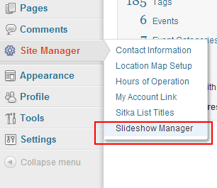
- Log into your LibPress site and access the Dashboard administration screen.
- Hover over the Site Manager menu item at left and click on .

Best Practices
Images used in the slideshow should be 960px wide by 288px high.
If you create your own slide, you need to upload it to your Media gallery first and tag it as “slide”. It will then appear in your Slideshow Manager. For a general guide to slide creation, see the diagram below.
The following tips will assist you in creating user-friendly slideshows:
-
- Before adding a slide to your slideshow, consider where it should link to for additional information. The slide itself should not contain very many words: a sentence or two at the most. The goal of the slide is to capture attention and redirect a patron to another page for detailed information.
- You can use any graphics software to create slides for LibPress. Canva, a free, online graphics tool has also been recommended and is used by a number of LibPress libraries.
- Create your template with dimensions of 960px wide by 288px high. Also, try to leave the left, right and bottom 50px of the slide blank as that space is overshadowed by the caption and navigation arrows, as per this diagram.
- Once you’ve followed these tips you’re ready to upload your slide to the Media folder on your Dashboard.
- Remember to give it a tag of “slide”.

Tips
- Remember that there are navigational arrows at the left and right sides when creating your design.
- The goal of the slide is to capture attention and redirect a patron to another page for detailed information where the text can be read by a screen reader, or enlarged or have a contrast layer applied for those with low vision.
- Consider that slides will be very small on a mobile device, and any text should be large and in high contrast with the background.
Display options
- From the Slideshow Manager, scroll down to the bottom of the page.
- You can choose to display or hide captions by clicking on the checkbox.
- You may also select where thumbnails are displayed, if at all.
- In the Transitions section, you can change how the slide move from one to the next. By default they scroll horizontally, but they can also slide vertically or you can cross-fade between slides.
- Once you’ve made your selections, click at the top of the page.
