Note about best practices with images
Best practices when using images is to not embed a lot of text. Focus on a catchy image and a header. The reasons are that accessibility programs will not be able to read the text in an image, and that sizing of an image and display are variable according to devices. All text information should be repeated or be contained within the Event description itself.
 Featured Image
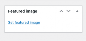
This image is added to your event from a box on the right side of your Events editing screen. This is the image that will display across all views of the calendar, as a thumbnail.
Recommended to have a general image that represents the type of event that is being offered, so with recurring events, this is the image that will tell the patron that this event is a Book Club or a Storytime.
Featured Images are designed to appear at a max width of 300 pixels. Please consider best practices and not use a lot of text or in small type, as this will not be visible in thumbnail view, and for best practices as described above.
Embedded Image(s)
Additional images may be added to the Description area itself, either to distinguish between Series Events, or to provide an Author image, or a linked Image to the ILS for a book cover. The size of these can be modified.
Resizing an Image
- Create the Image with custom dimensions directly in Canva, or
- In the LibPress program, go to Media and click on the image being resized. Click on edit underneath the image. On this page, you can crop and scale the image – choose a height of 300px and choose Apply changes to all EXCEPT thumbnail, then click Save. (Note: if you are using a larger version of this image elsewhere, upload a new image to resize and be sure to select the correct smaller one as your Featured Image for the event).
