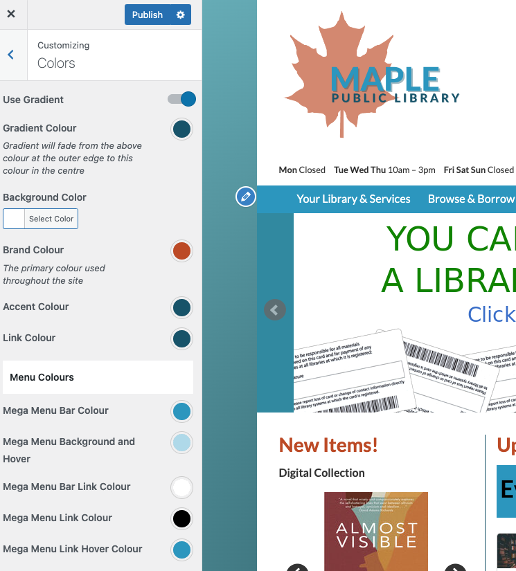
The colours you choose for your LibPress site will have the most visual effect on your website.
Best practices for colour selection goes further than branding (matching to your logo), such as important considerations around accessibility and visual and other concerns. Consider carefully contrast, colour blindness, and more.
Customizing Colo(u)rs
Background
Note that this is a fussy area and you may need to contact us for help.
- Gradient: a slight tonal change from one colour to another.
- Background: a single colour (will not apply if Gradient selected)
Branding
- Brand: will usually correspond to the Search box colour
- Accent: a subtle element, usually applies to highlight | line
- Link: will apply to most links across the site (check the contact email in footer for a quick check)
Mega Menu
- Bar Colour: the main colour that appears when viewing the site
- Background and Hover: when the cursor is moved across the enu
- Link Colour: applies to links in drop-down menus where active
- Hover Colour: a feature where if the cursor hovers over the link, the colour will change (only on desktop where a cursor is in use)

